Loading
Loading

When users create reports in Power BI, they might encounter some slowness and performance issues. Unfortunately for them there is no way to understand what is causing these issues.
Our goal in this project was to understand and design a UI that easily is readable and understandable by our users and guide them how they can find and solve these performance issues.
What is Power BI?First step for me was to understand what exactly usually causes these perf issues by collaborating with engineers and product managers.
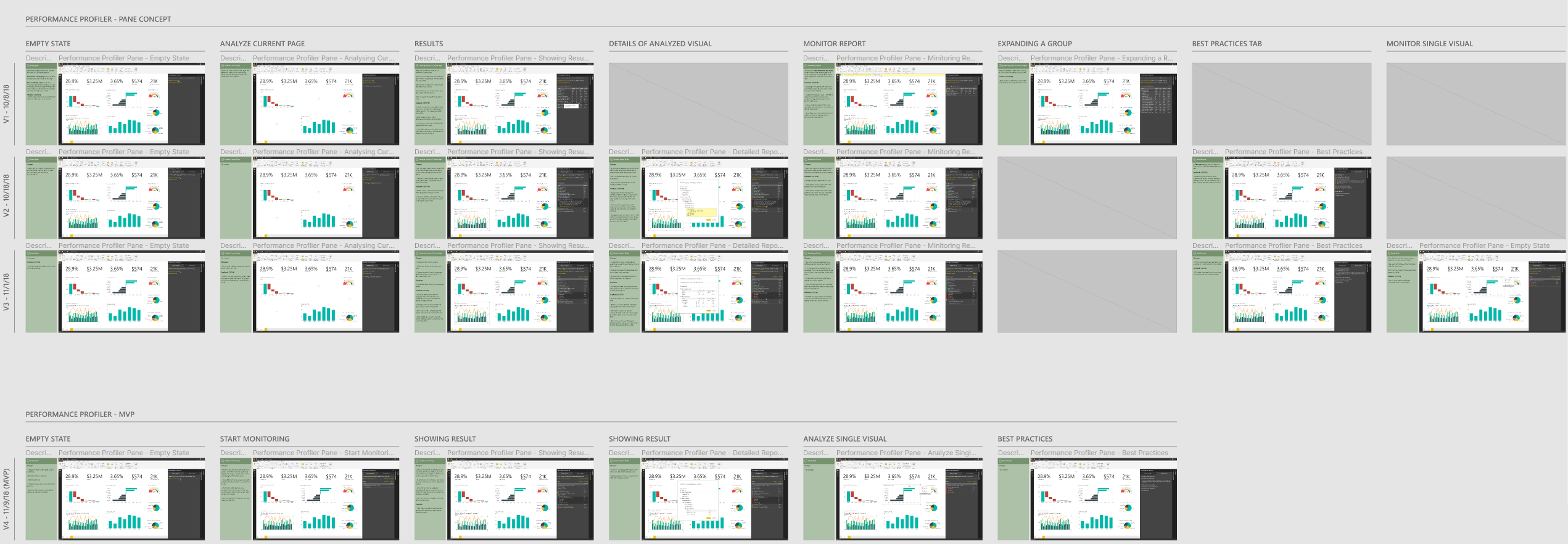
After initial discussions with product owners and developers and understanding constraints and requirements I started designing step by step mockups for this scenario and reviewed them after each iteration with team to see how we can improve these concepts until we reached a good design to move forward.
Basically after our brainstorm sessions, we all agreed that we need an entry point in UI where users can initiate the analyzing their report from there, then we will scan their report and provide a list of all data queries and operations in a easy to read UI.
There were two entry points that I had some concepts around them, each had their own pros and cons which I will go through them later:
These are some of the iterations of this scenario:
Since we already have the ribbon in Power BI, we could use this space to add another button where users can initiate this process. This way we won't have any new elements in UI to build and engineering cost will be low.
I designed these concepts and did some user research with each one, you can see the user feedback for each task below:
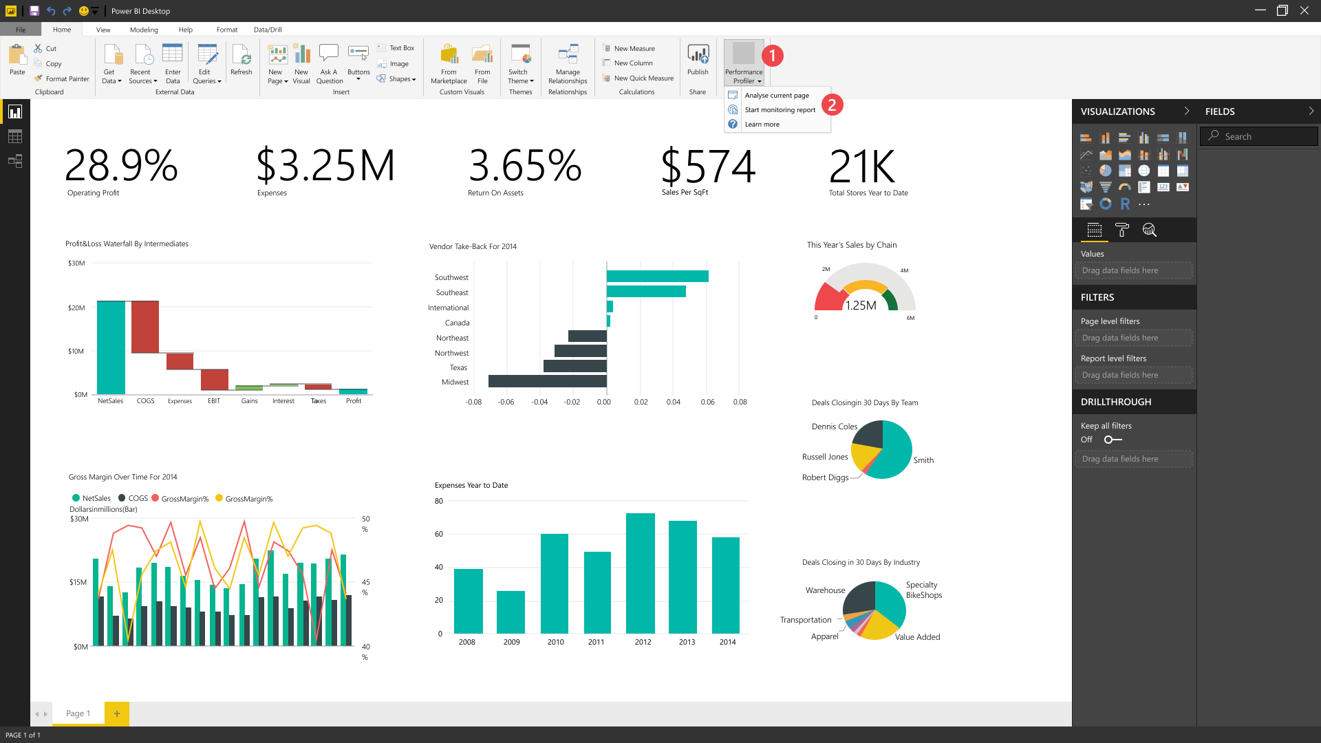
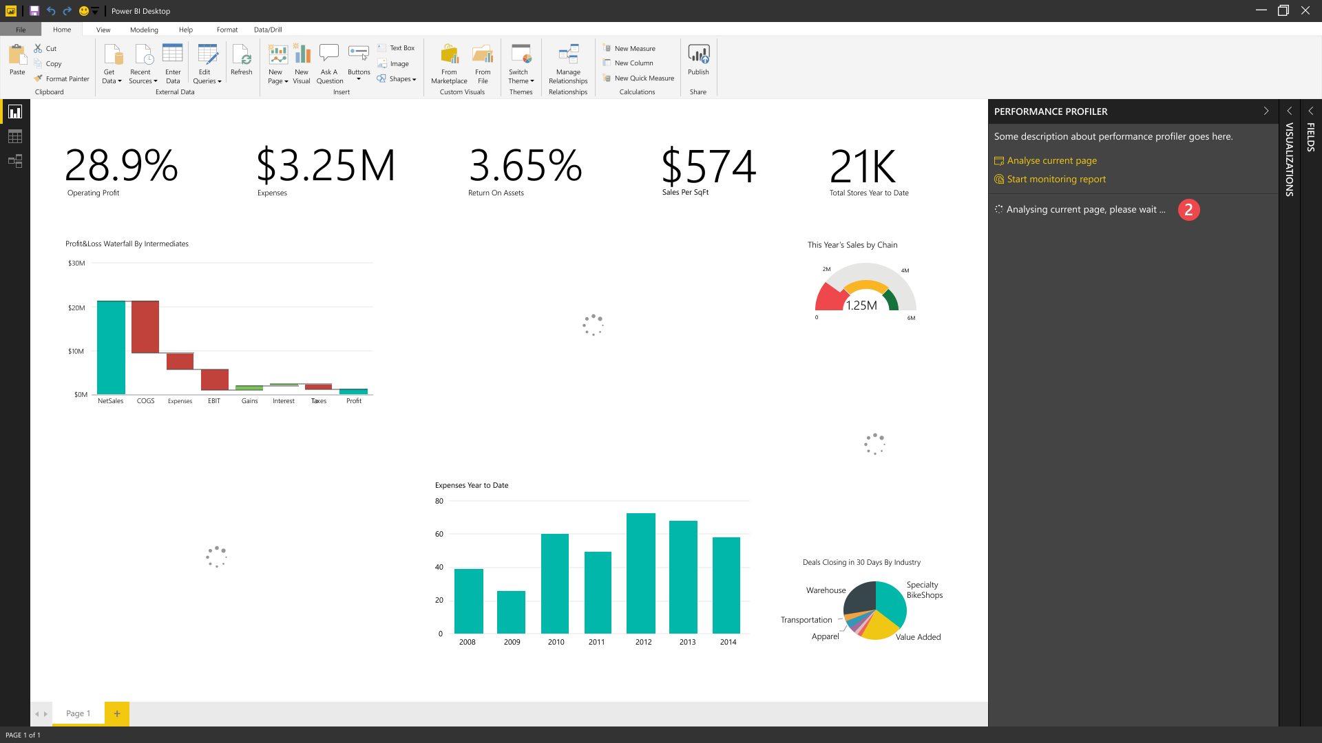
1. User needs to select an option from performance analyzer button in ribbon.
2. Analyze the current page which refreshes the page and return results of this page. Start monitoring report which start analyzing in background and user can start interacting with whole report while analyzer keeps tracking of all interactions and when user stops it, it will return results.
Users were able to find this entry point.
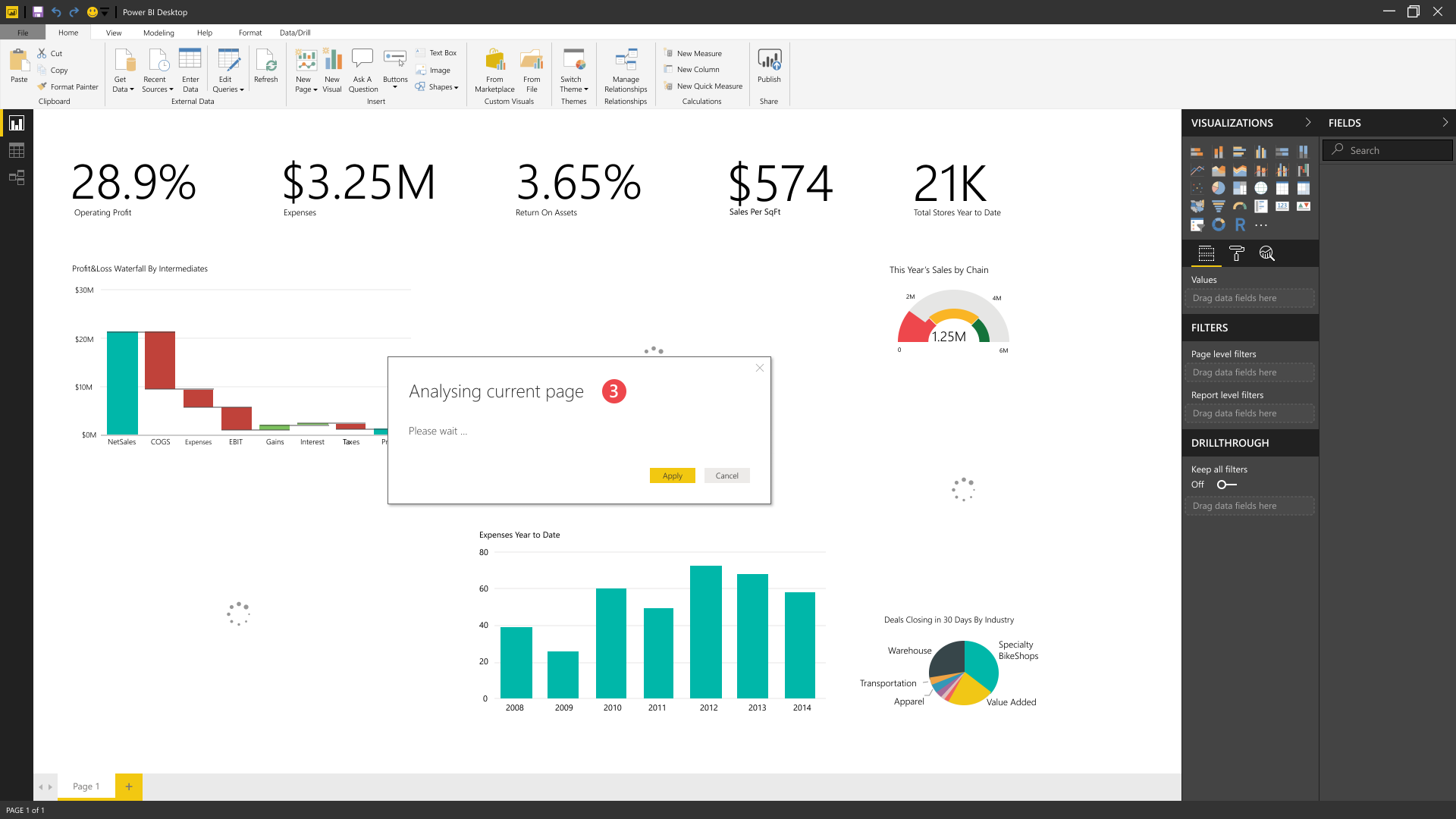
3. After selecting analyzing the page, a modal box pops up and in background page gets refreshed.
Popping up a modal box every time user wanted to start this process was really distracting since it was blocking view of user report.
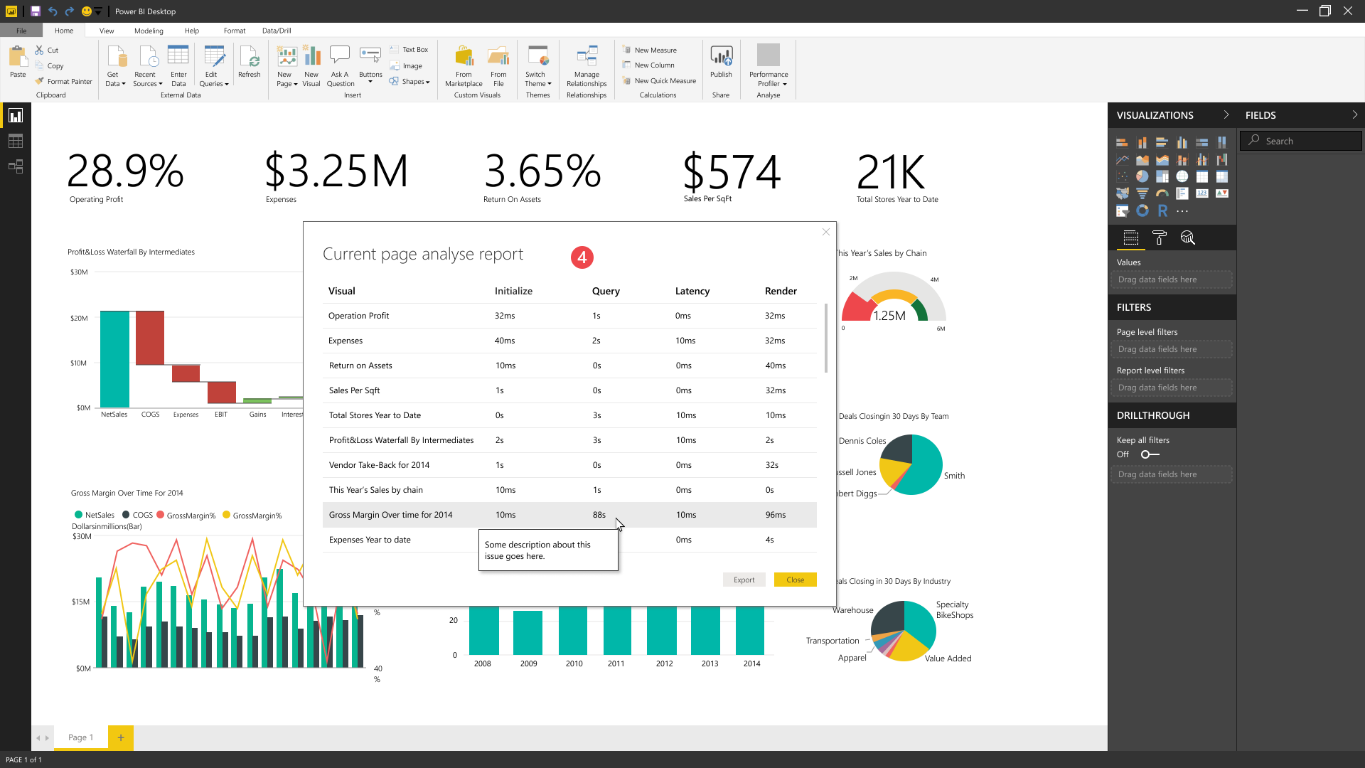
4. When refreshed is done, modal box shows the analyze report for visuals in the page.
In future releases we wanted to have a place to show more detailed and advanced information about each row in results table. This modal box was not a best place to show these information.
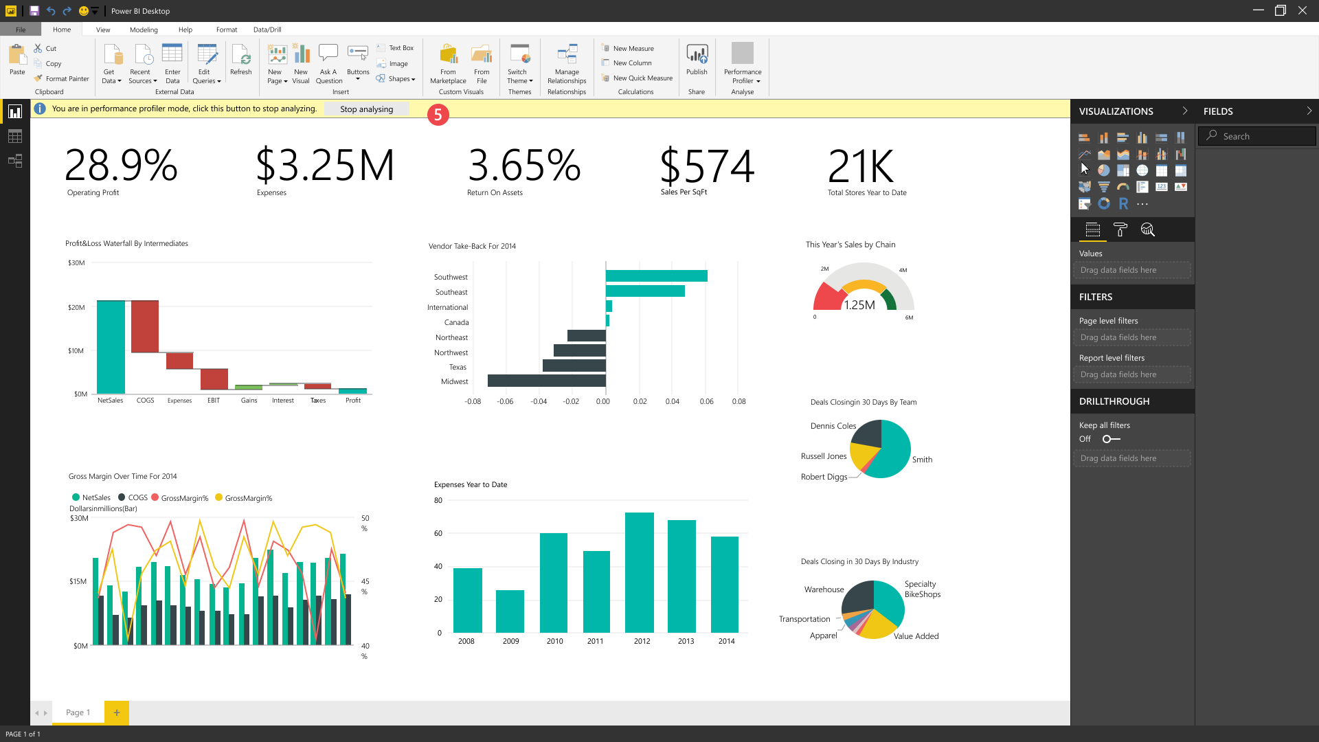
5. By clicking on Start monitoring the report, performance analyzer starts to capture all user’s interactions on report level and on every page and it stops when user clicks on stop.
This step wasn’t really clear to users and they were not sure what to do in this step.
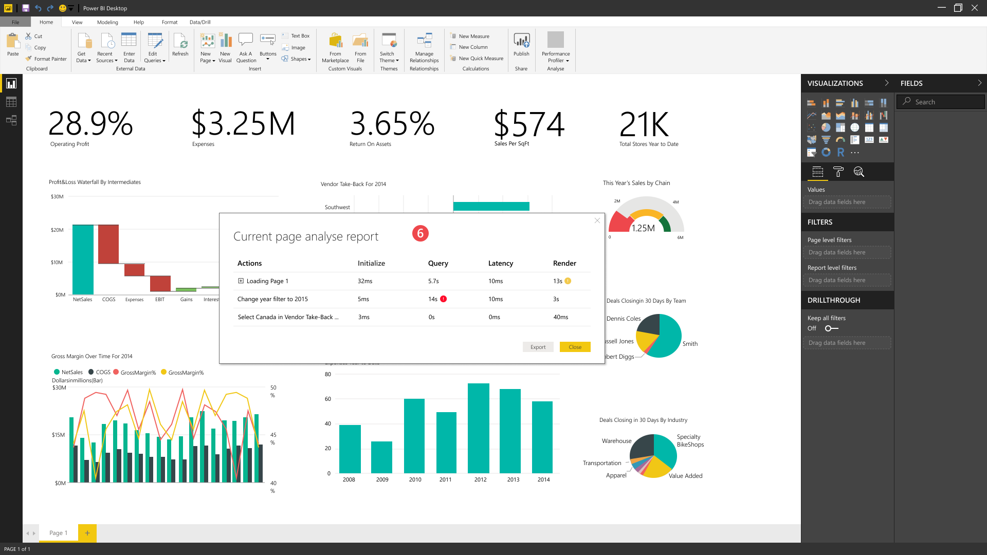
6. When user clicks on stop button, modal box shows the report of user actions in that session.
Major issue about this concept was that users were not able to interact with report since we show results in a modal box. We wanted to let users click on each row of result and see affected visual in their report.
As this concept required a design a new interface, the development cost and time would have increased. However, the resulting overall experience would significantly improve.
Same as previous concept I designed and tested with users to see their feedback:

1. Analyze the current page which refreshes the page and return results of this page. Start monitoring report which start analyzing in background and user can start interacting with whole report while analyzer keeps tracking of all interactions and when user stops it, it will return results.
Users were pleased with the initial look and placement of the feature.
2. When user clicks analyze current page, we refresh the page and show a message about analyzing the page and will show results when it is complete.
The message in pane and also loading spinners on report page were clear to users and they understood what is happening right now.
Couple of users had trouble understanding difference between analyze current page and report.
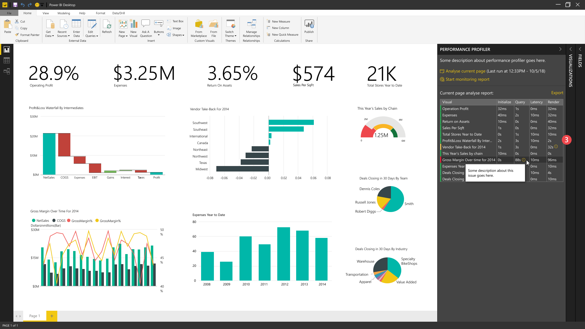
3. Here user can see the results of the analysis in a table view. Each row has a colored bar that shows the performance of that visual, they are green, yellow and red. We can show an alert icon in front of cells that seems having issues. Users can hover over an item to see some description about that issue. They can export the results to examine it more.
Users wanted a way to see more details about each row in the table. They also asked to highlight related visuals in report by hovering over each row in table.
Using those tiny colored bars on left side was not accessible for some users.
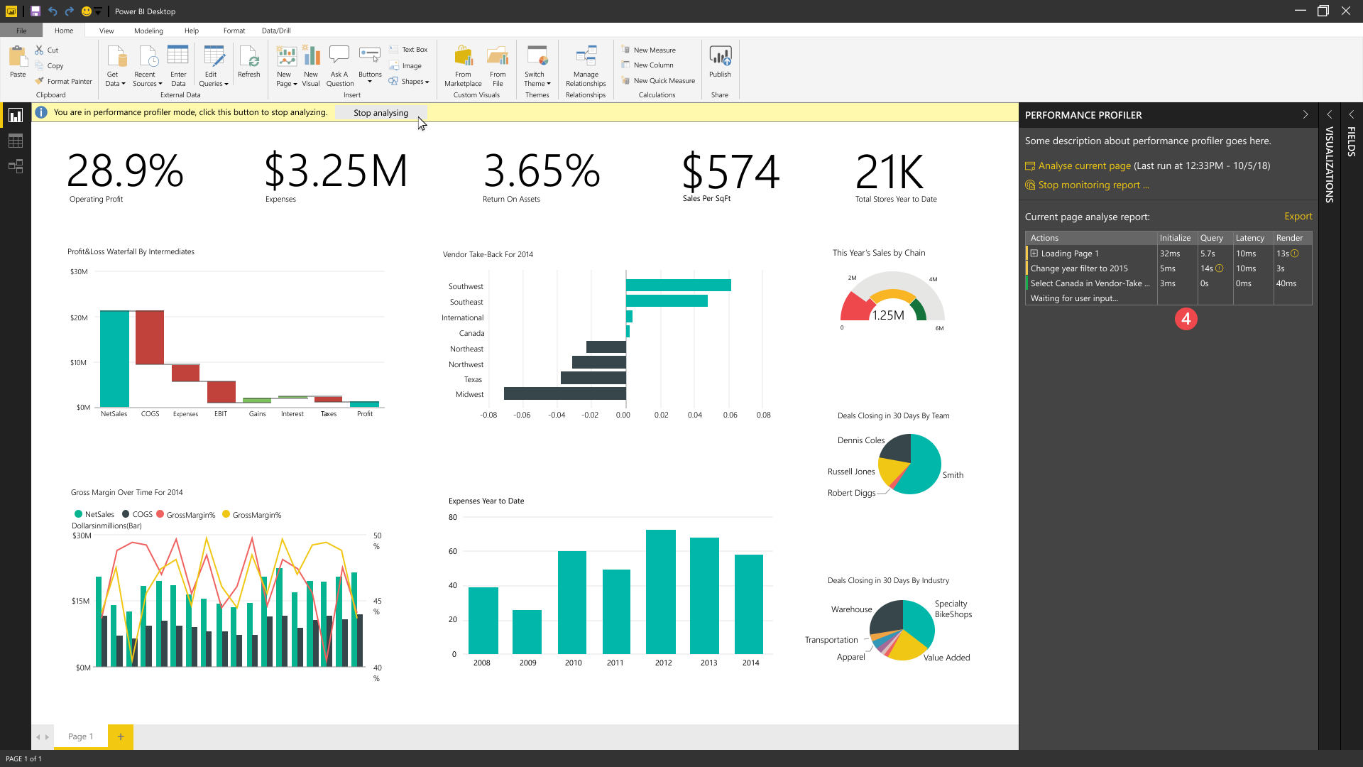
4. By clicking on Start monitoring the report, performance analyzer starts to capture all user’s interactions on report level and on every page and it stops when user clicks on stop.
Sorting might be helpful in table, like sorting by query time which can help users identify issues faster.
Using the yellow bar might not be best solution to stop the monitoring since our web version doesn’t have this bar.
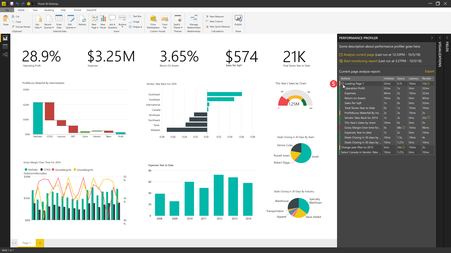
5. User can expand the page row by clicking on + icon and see individual visual’s stat.
Some users suggested that in some cases they might only want to analyze a single visual instead of whole report.
After collaboration with the team and sharing the user research findings, we decided to move forward with pane design with changes based on the feedback from our users.
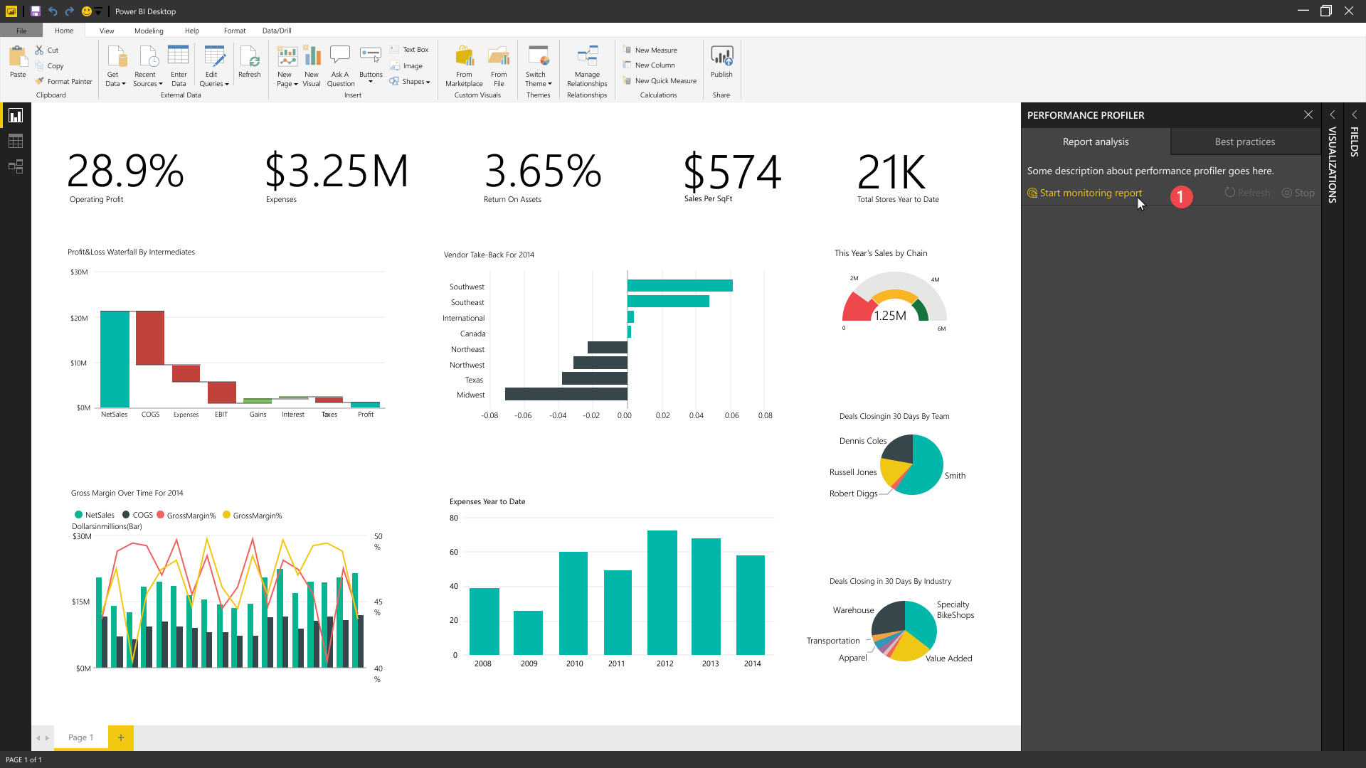
1. We merged analyze current page and start monitoring actions into one action, Start Monitoring Report and added Refresh, Stop buttons. This solved the confusing issue that some users had about two different actions and wasn’t sure which one was the right action and removed extra unnecessary steps for this scenario.

2. By clicking on Start link report gets refreshed and results will be populated in table.
3. To get details of current page, user needs to start monitoring and click on refresh link in pane
4. By selecting a row in table, related visual will be highlighted in report page.
5. After starting analyze, table gets populated with a timestamp of when user started monitoring and waits for user input on report to capture.

6. By selecting a visual in their report users can analyze that specific one only and see results in table.